BABEL
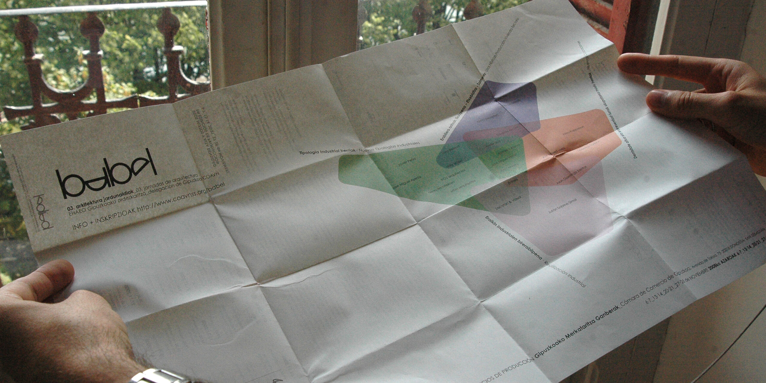
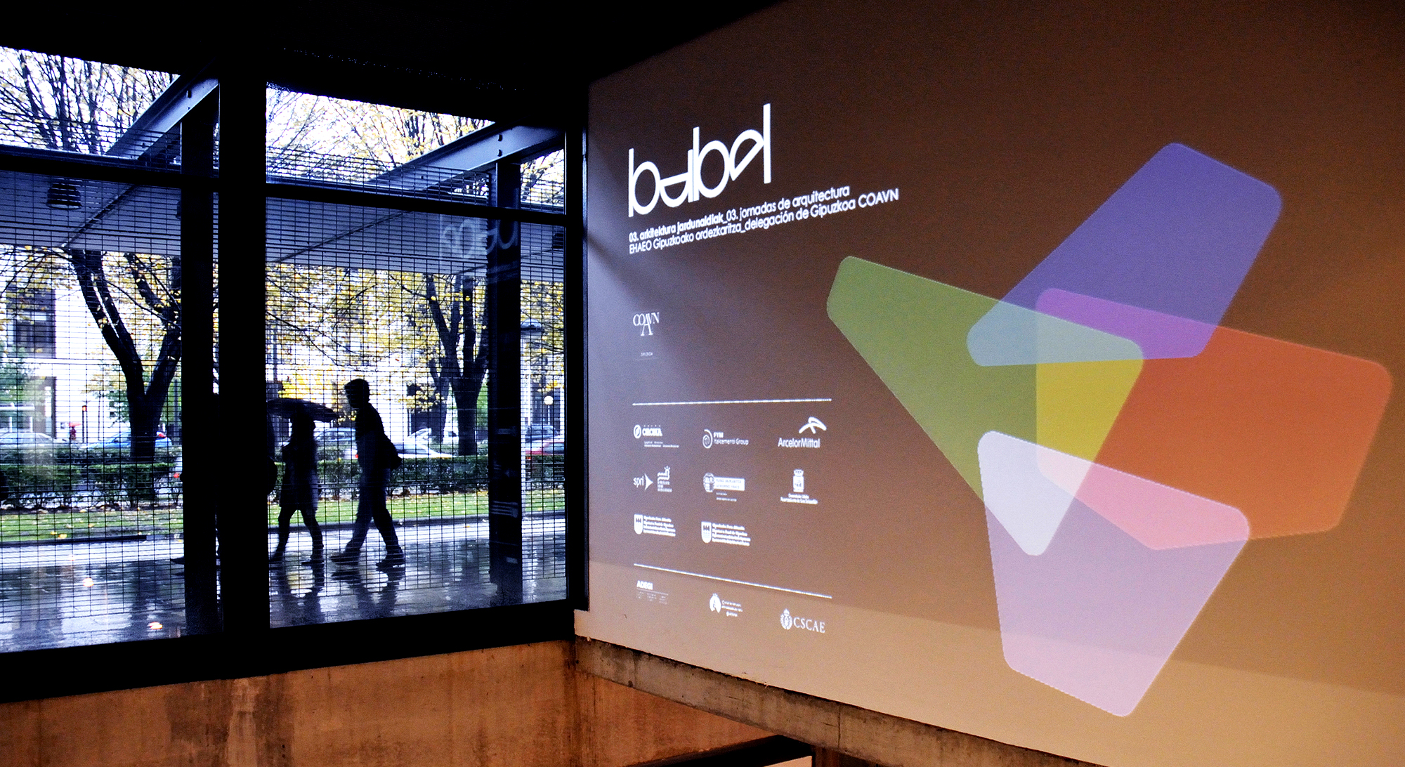
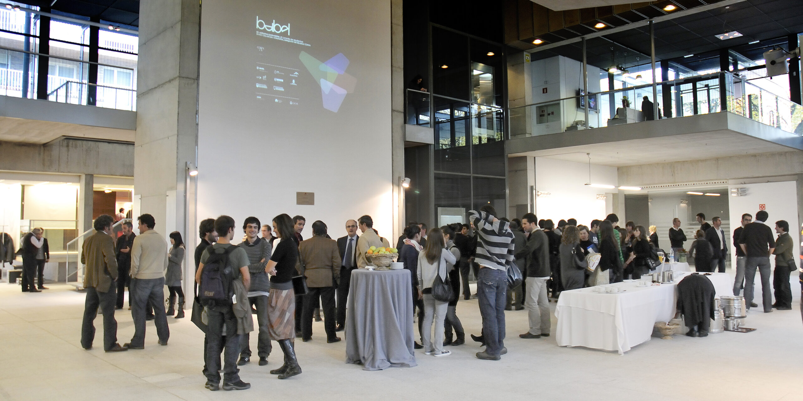
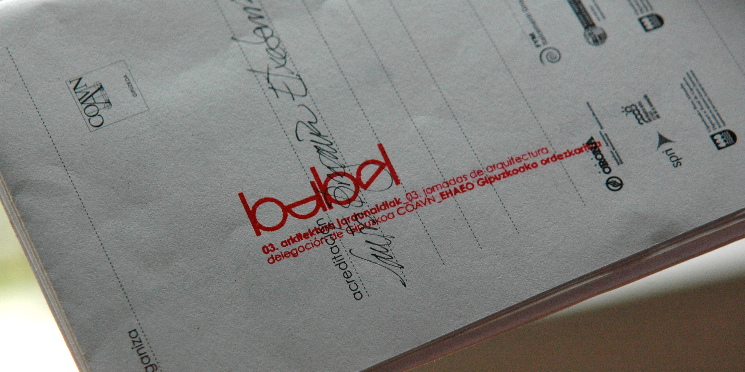
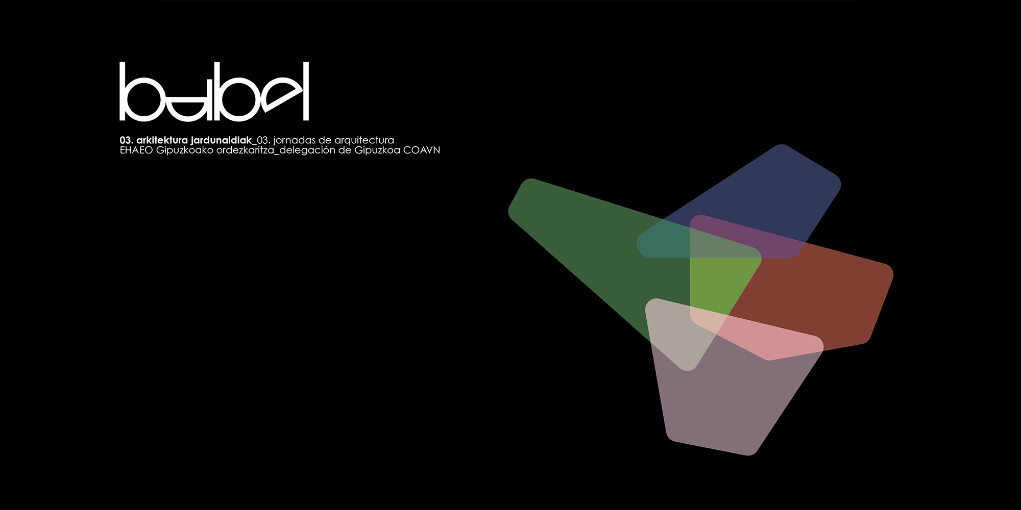
03. Architecture conferences. COAVN Gipuzkoa. Donostia. 2008.
Logo for the architecture conferences organized by the Guipuzcoan delegation of the Basque Navarro College of Architects.
Preceded by the editions held in 2004 and 2006, the 3rd edition of the BABEL Architecture Conference was held on Thursdays and Fridays in November 2008. The theme of this edition was MIXED USE AND HIGH DENSITY IN PRODUCTION BUILDINGS
ALFA ARTE
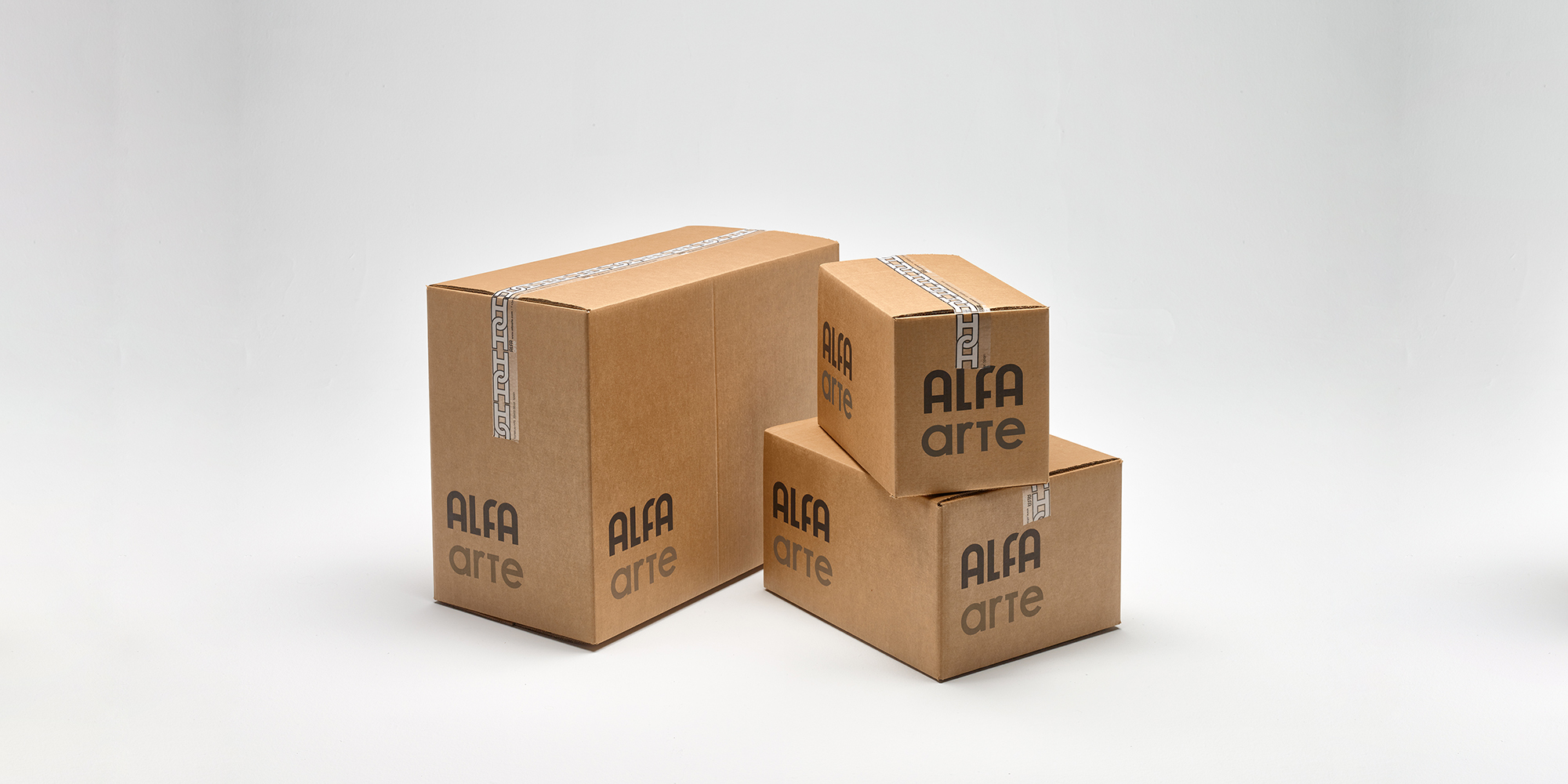
Eibar. Alfa Arte. 2016
Based on the well-known logo of the great Eibarresa company known especially for its sewing machines, present in so many homes, the challenge was to carry out a restyling that was respectful of the anonymous designer who created such a great logo in the 50s for the ALFA brand.
BASQUE CULINARY WORLD PRIZE
Brand for BCWP. Donostia. 2015
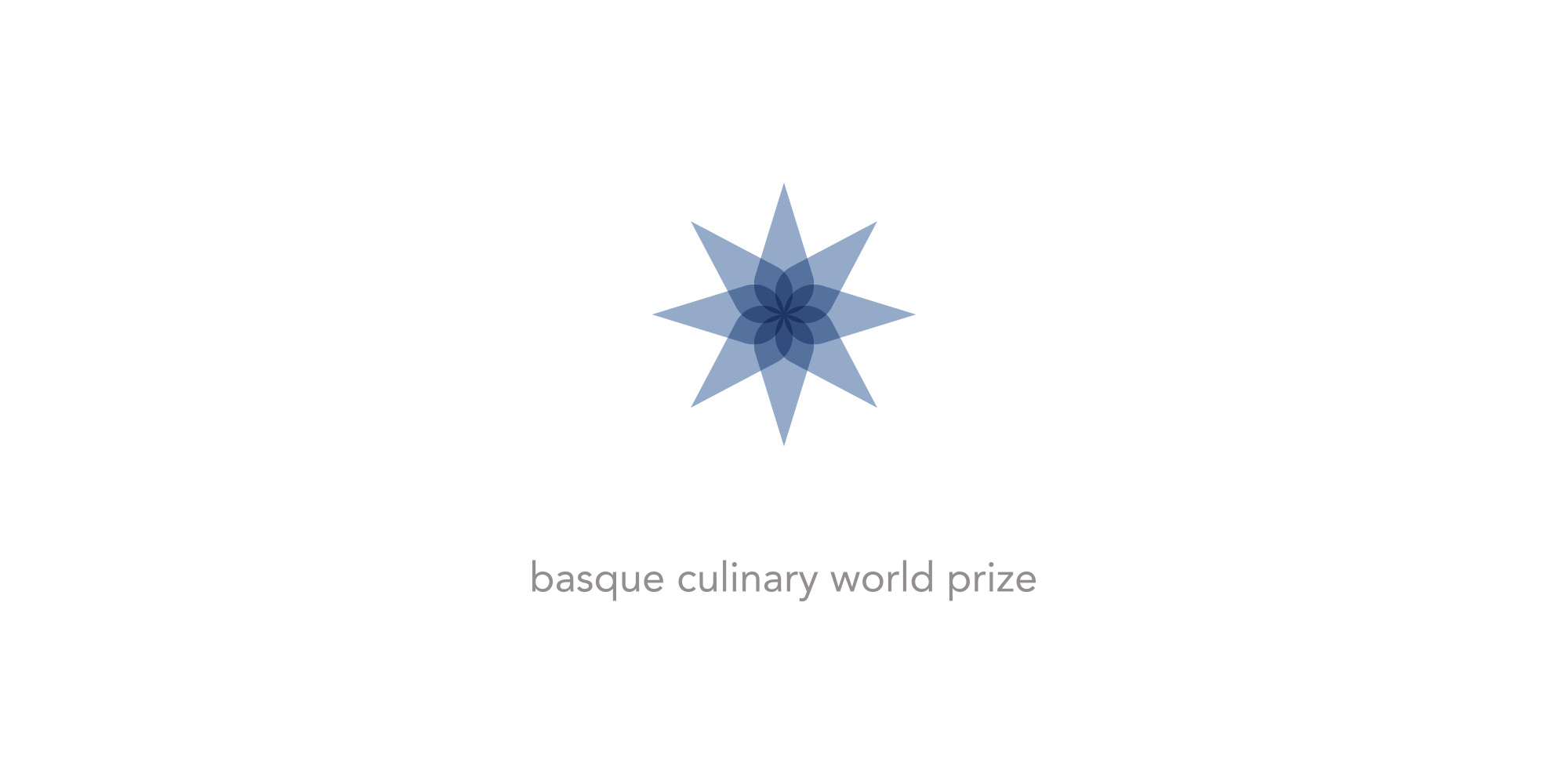
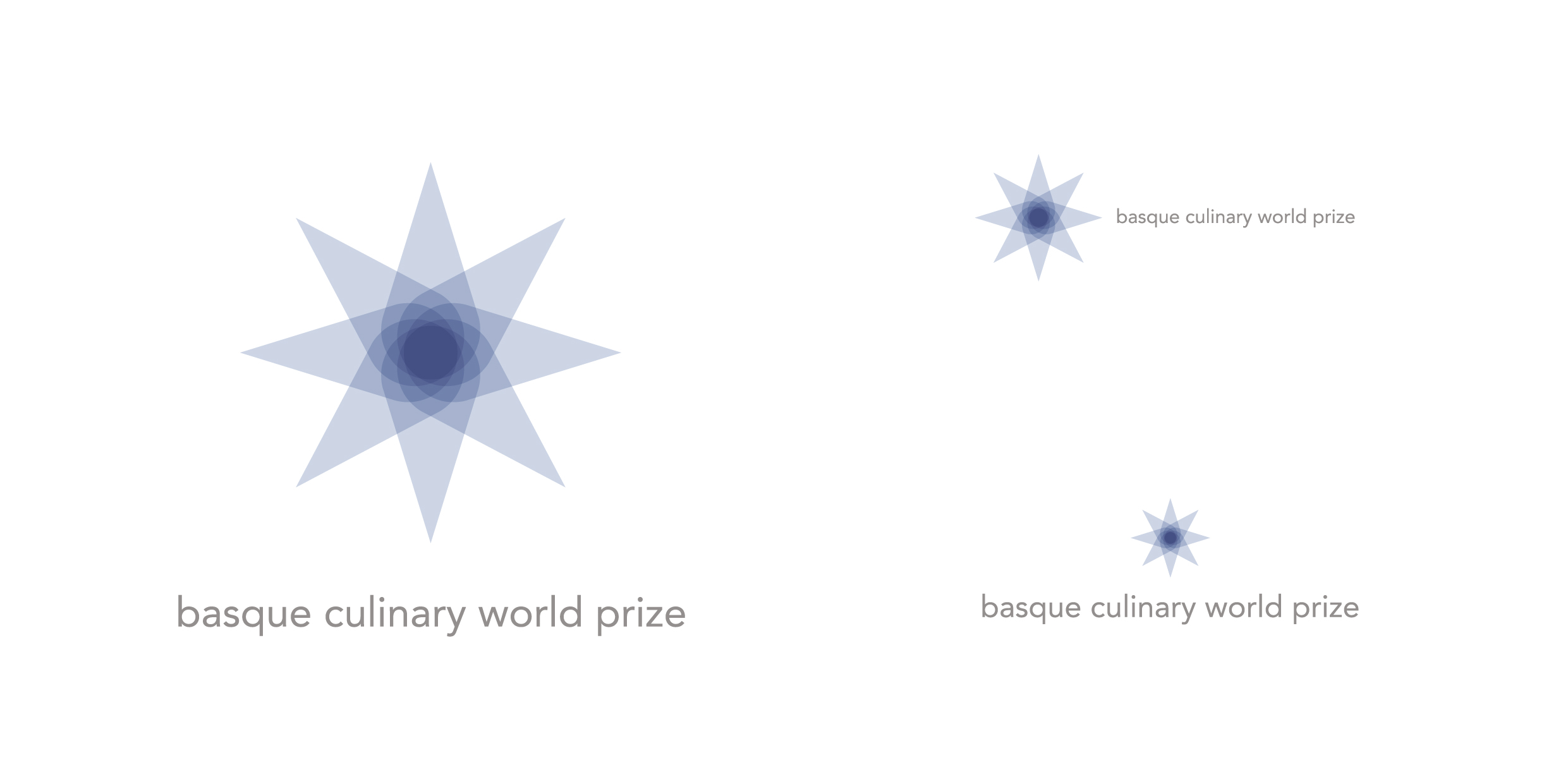
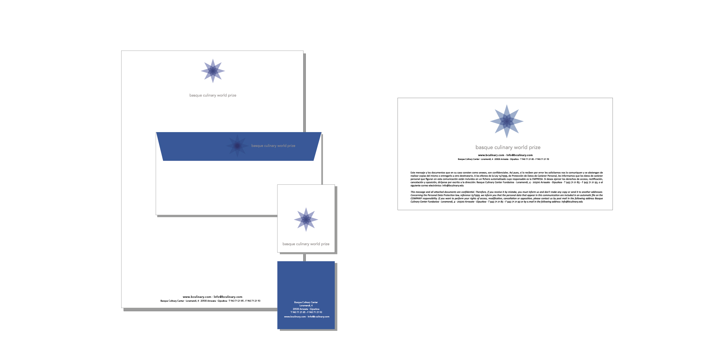
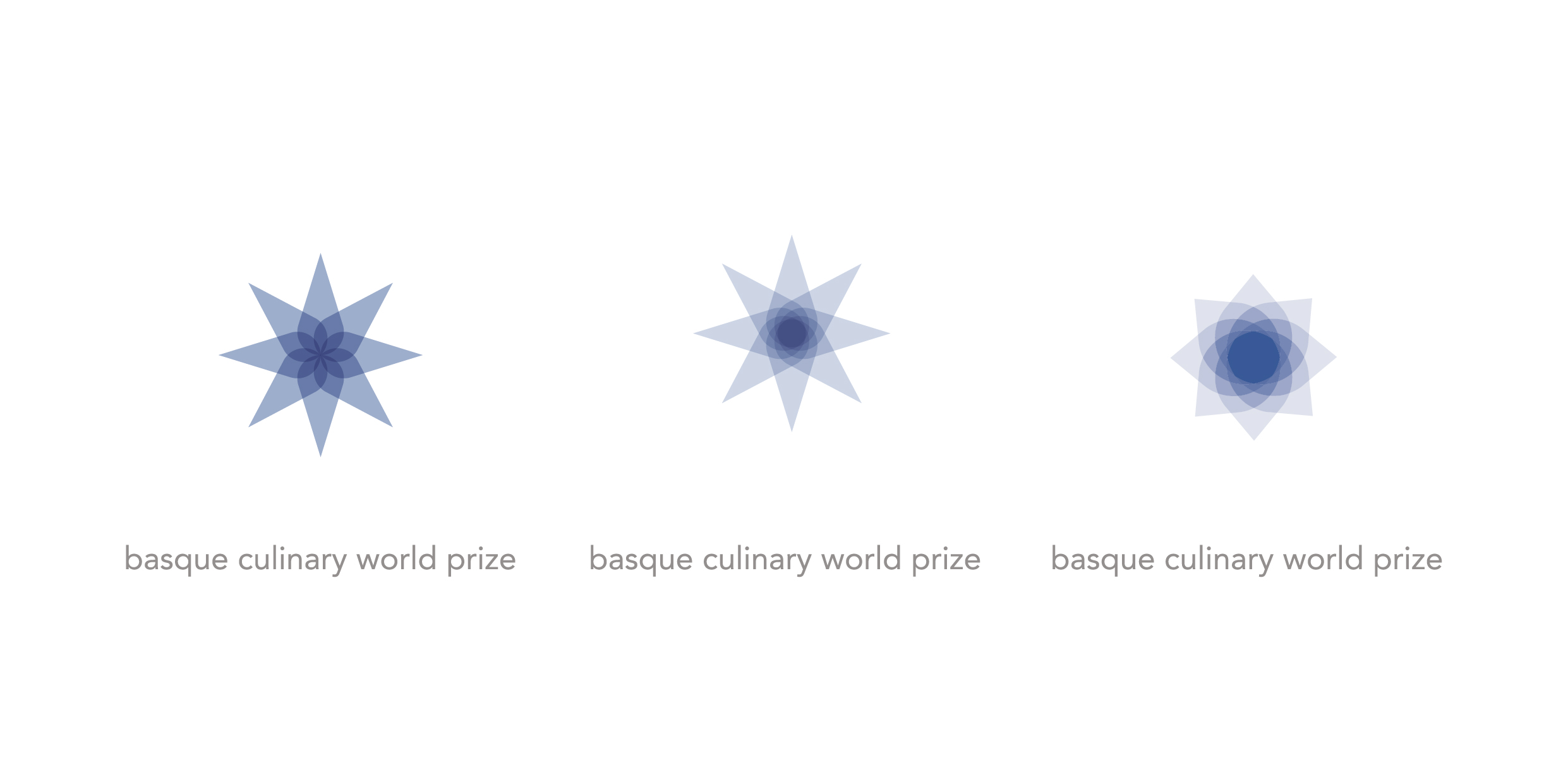
Logo for the BCWP award. The award that since 2015 has tried to reward the work carried out by some chefs who through their work achieve social transformations.
Like a superposition of layers: Engine of changes, transforming fire, gas fire, blue, looked at from above, from the sky, this is how a star, a flower, a diamond forms us. Indigo, the color of the worker of the sea, of the garden, of the producers who nourish kitchens with food…
SEMINARIXOA
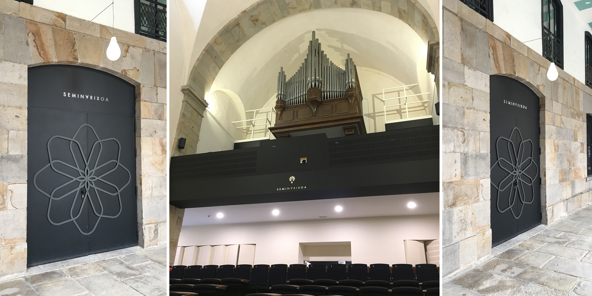
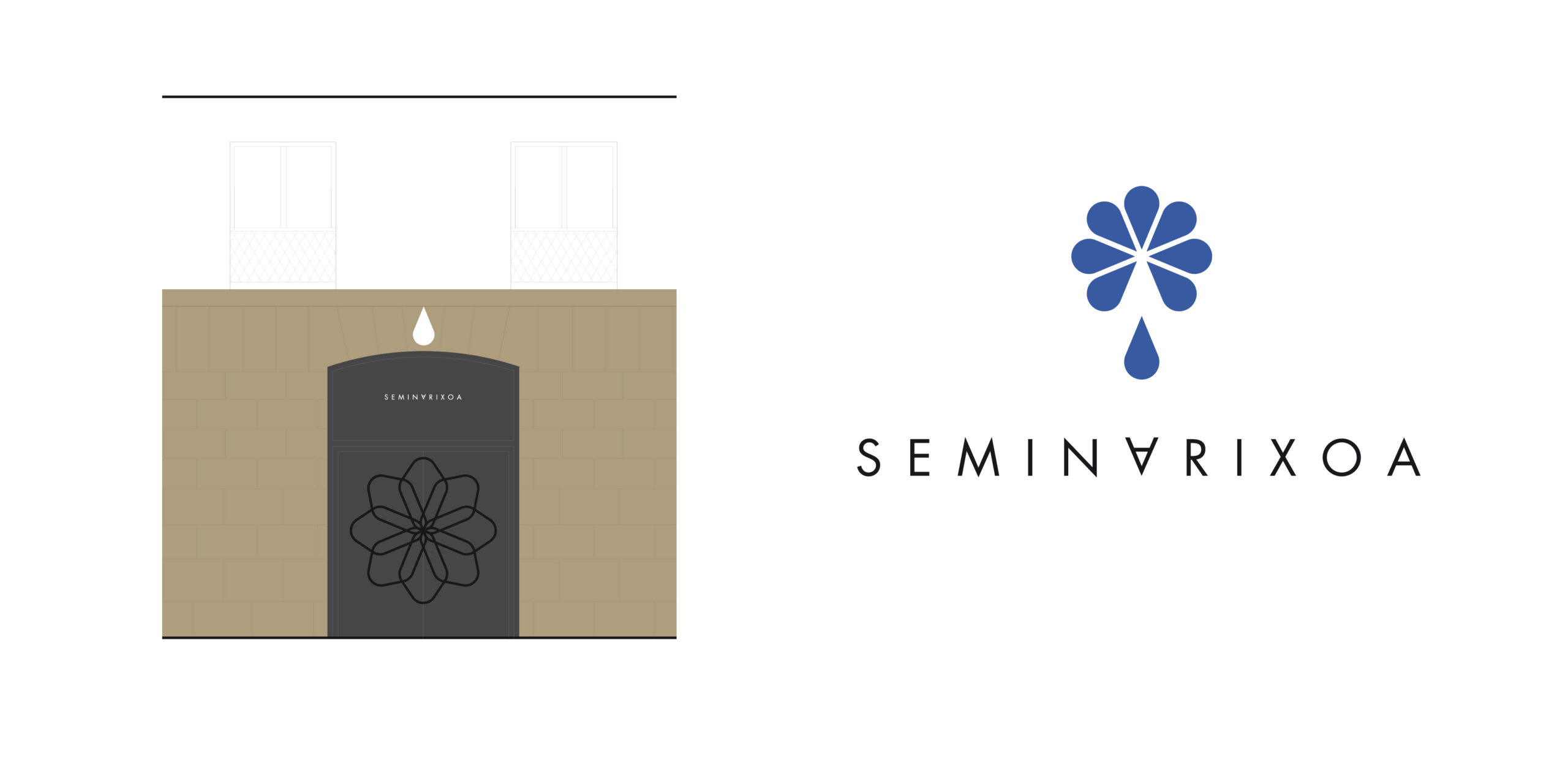
Logo for Seminarixoa. Bergara. Gipuzkoa. 2017
The chrysanthemum: So common in the decorations of the Basque Country, this solar symbol is also the imperial flower of Japan. In Asia, the yellow chrysanthemum is a symbol of order and perfection. Connecting, mobilizing, the geometry of radial symmetry inspires us with these concepts of grouping, of character from oneself to the expanding society.
The eight-pointed star marks the cardinal points and the four intermediate points. It divides the sky into spaces comprehensible to the Augur, the magician who reads the future in this Temple through the passage of birds, the omens.
In SEMINARIXOA it acquires a special meaning, given that the petals resemble seeds and given that etymologically SEMINARY (*), a place belonging to or related to the seed. Originally conciliar and today desacralized and dedicated to the performing and musical arts, etc.
LEKUONA
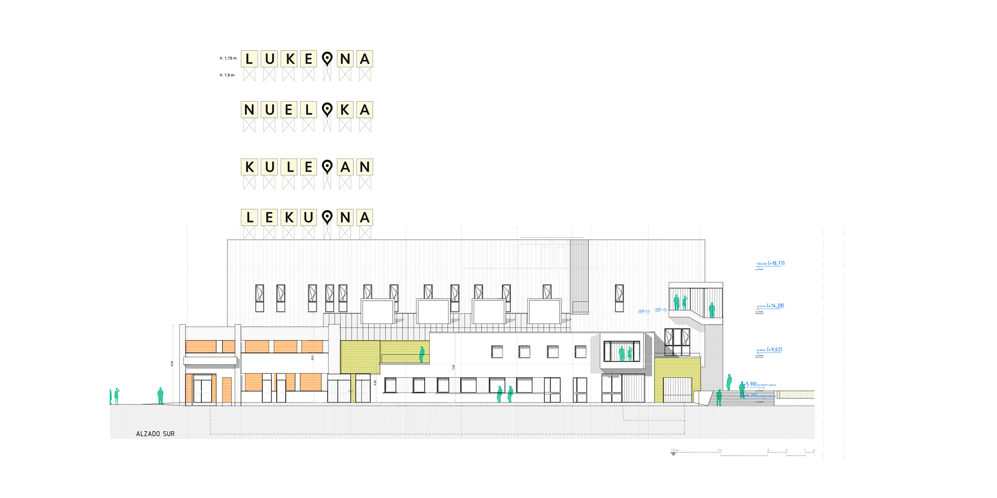
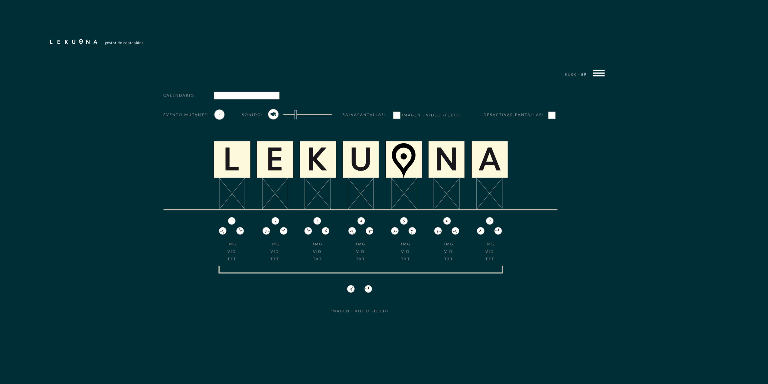
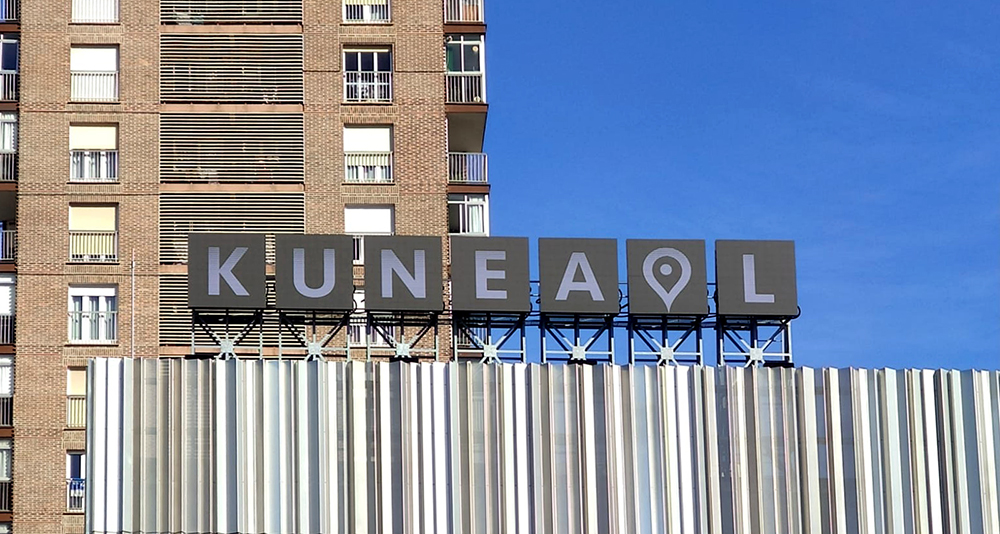
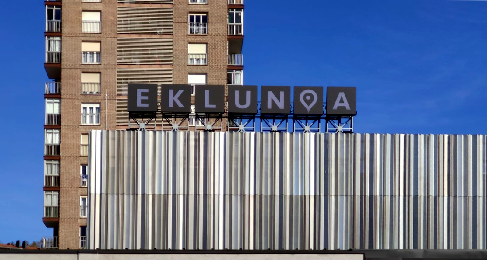
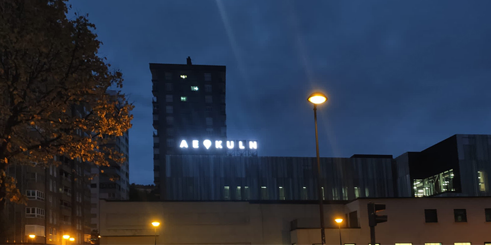
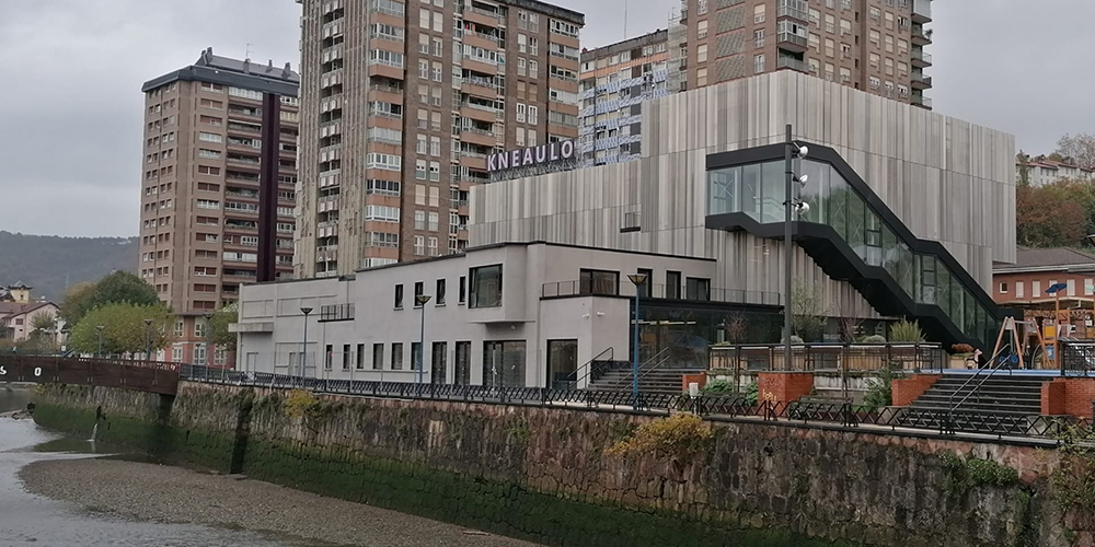
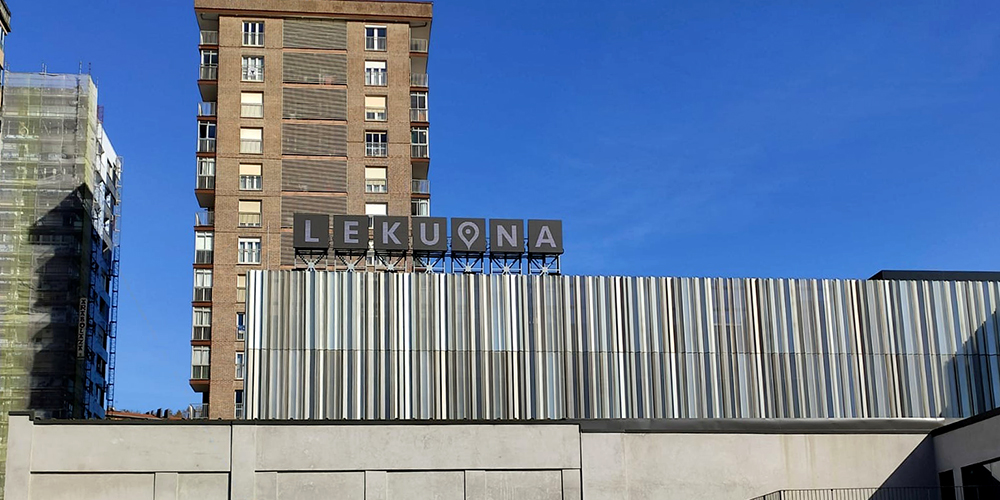
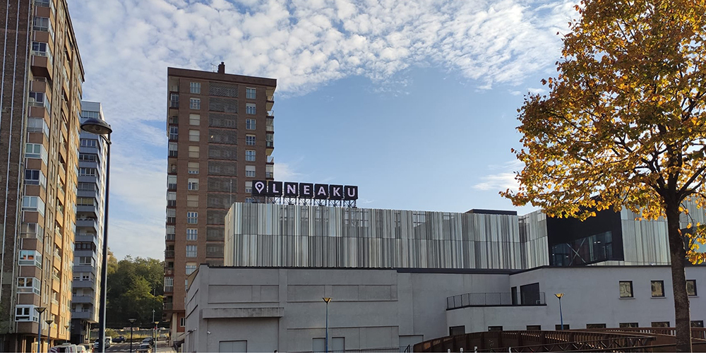
Naming & Logo LEKUONA. Errenteria. Centro Cultural. Gipuzkoa. 2020
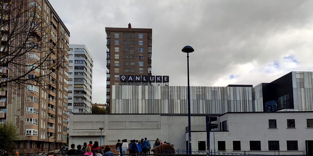
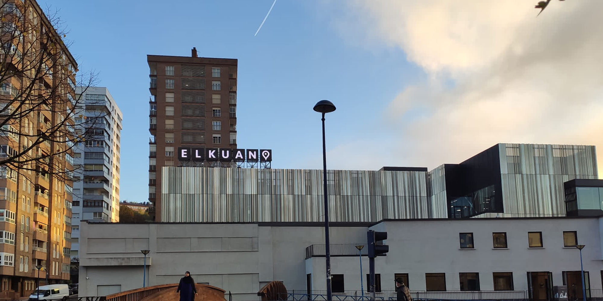
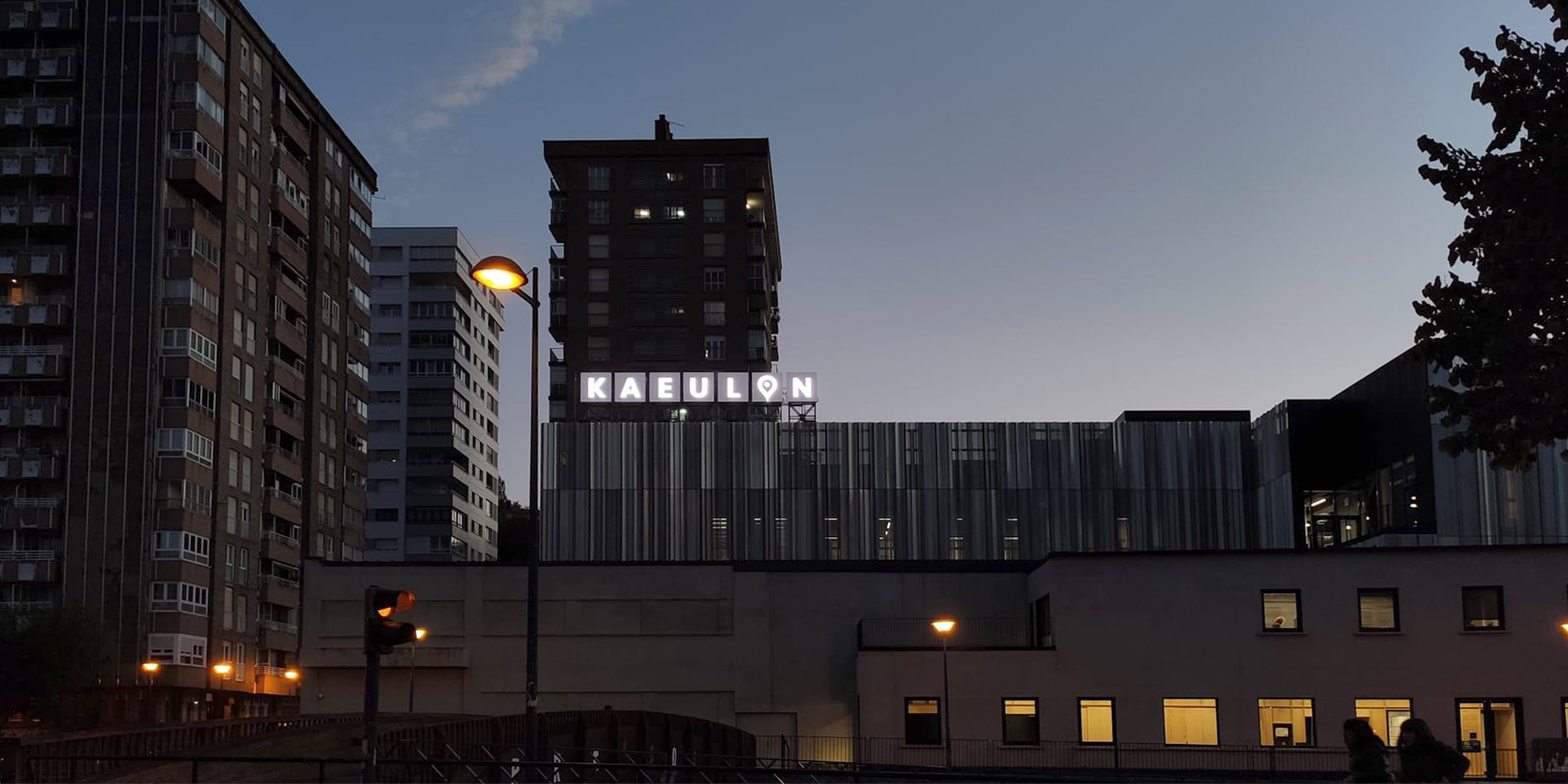
This Gipuzkoa municipality was formerly called “little Manchester”. A thriving paper, fur, etc. industry. The urban planning of Errenteria was full of industrial pavilions. Lekuona was a former bread maker. When it was decided to transform it into a cultural center, the city council asked us what to call it. The answer was clear, with another question: what do people call him? Lekuona was the answer, since its preexistence and its linked history left no doubt. Let’s call him LEKUONA then. But its mutant character in its uses gave an interesting vision to the proposal, let’s change the name of the place every day, combining the letters in hundreds of combinations… KULEONA, AELOKUL, OLNEAKU, ELKUANO, KAULEON, etc, etc
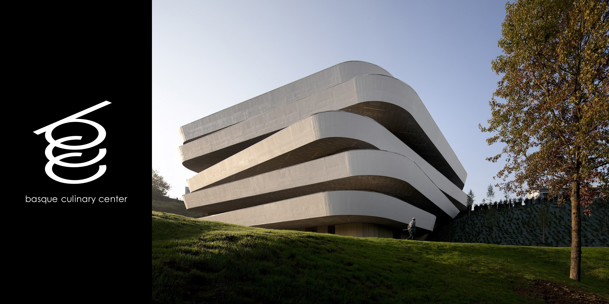
BASQUE CULINARY CENTER
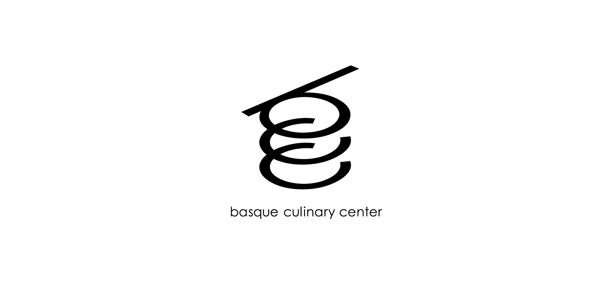
Logo BCC Donostia. Universidad de Mondragón. Gipuzkoa. 2016
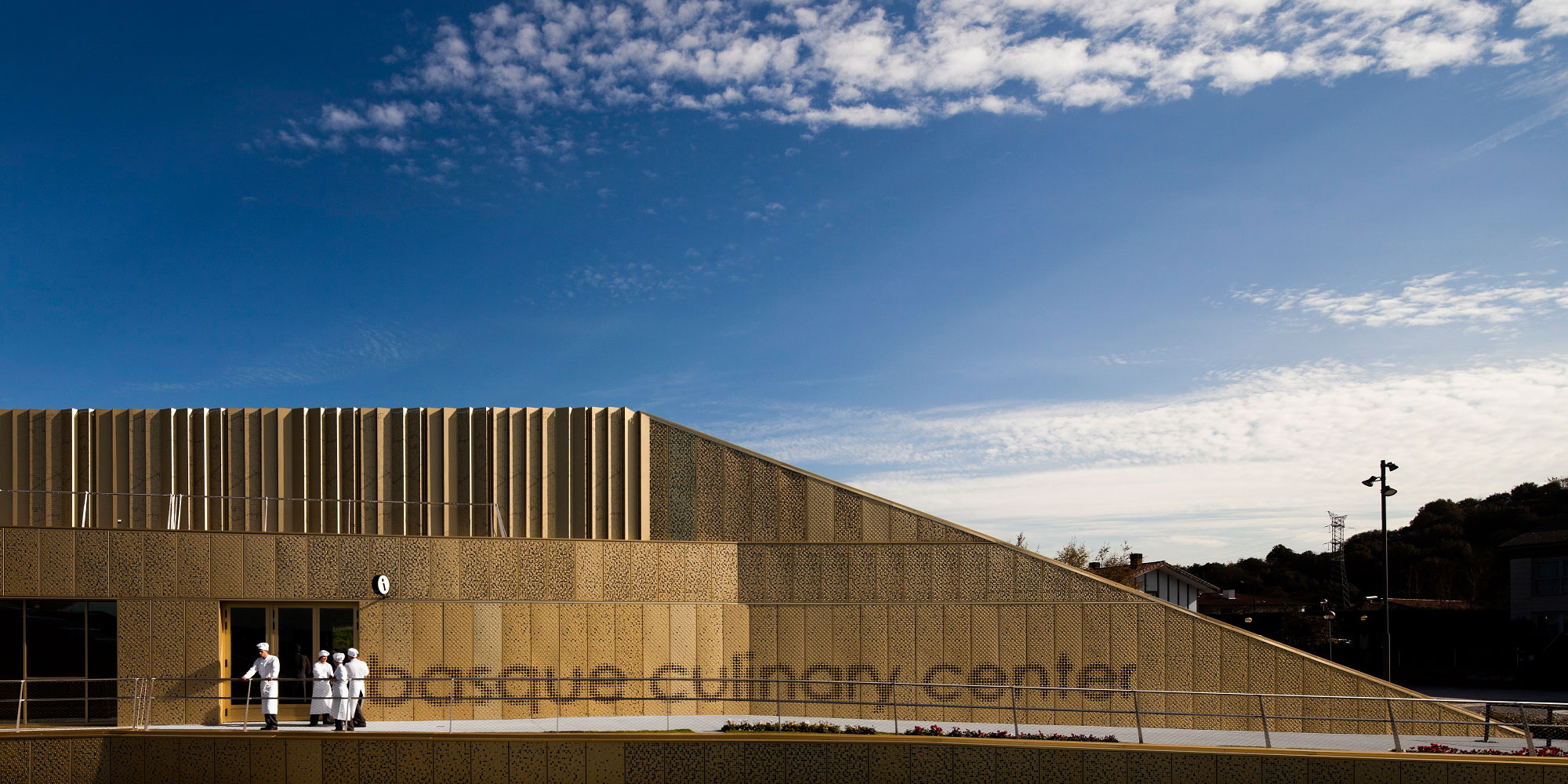
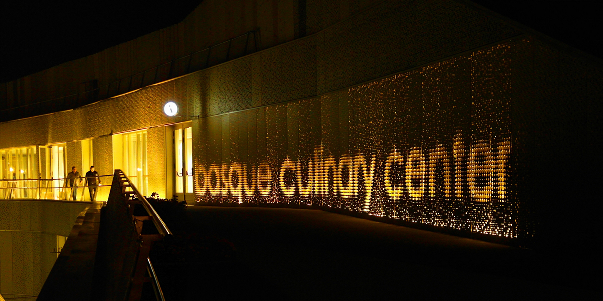
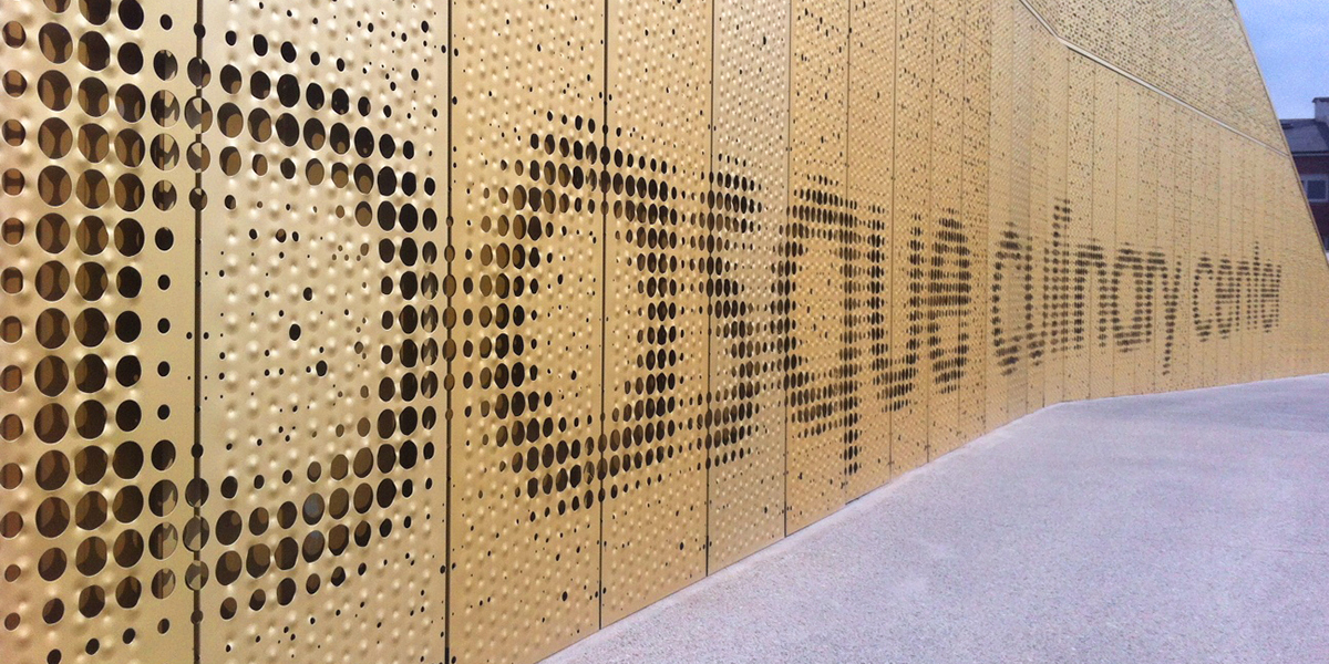
The Faculty of Gastronomic Sciences was born at the initiative of public institutions and the University of Mondragón. In this case, the graphic image was created at the same time as the building project, which was developed by the San Sebastian studio Vaumm. From the beginning of the process the image of stacked plates was present. This was undoubtedly an interesting driver for the projection and undoubtedly a useful aphorism for communication. However, we became tired due to the repeated insistence of the press.
